Creating a Hex Bin Map to Show Changes Pell Grants
By Brendan Graham in tidy tuesday data viz hex bin map
September 10, 2022
Get the data
First I read in the data and do some minor cleaning:
-
only include data post-1999 since it looks like 1999 isn’t a full year of data.
-
overwrite the
state_namevariable with the full state name instead of the abbreviation. This makes creating a hex bin map later on a little easier. One consequence of this is Puerto Rico and other US Territories are excluded
tt_url <-
  "https://raw.githubusercontent.com/rfordatascience/tidytuesday/master/data/2022/2022-08-30/pell.csv"

pell <-
  readr::read_csv(tt_url) %>%
  janitor::clean_names() %>%
  filter(year > 1999) %>%
  mutate(state_name = usdata::abbr2state(abbr = state))

pell %>%
  head(25) %>%
  get_table()
Explore the data
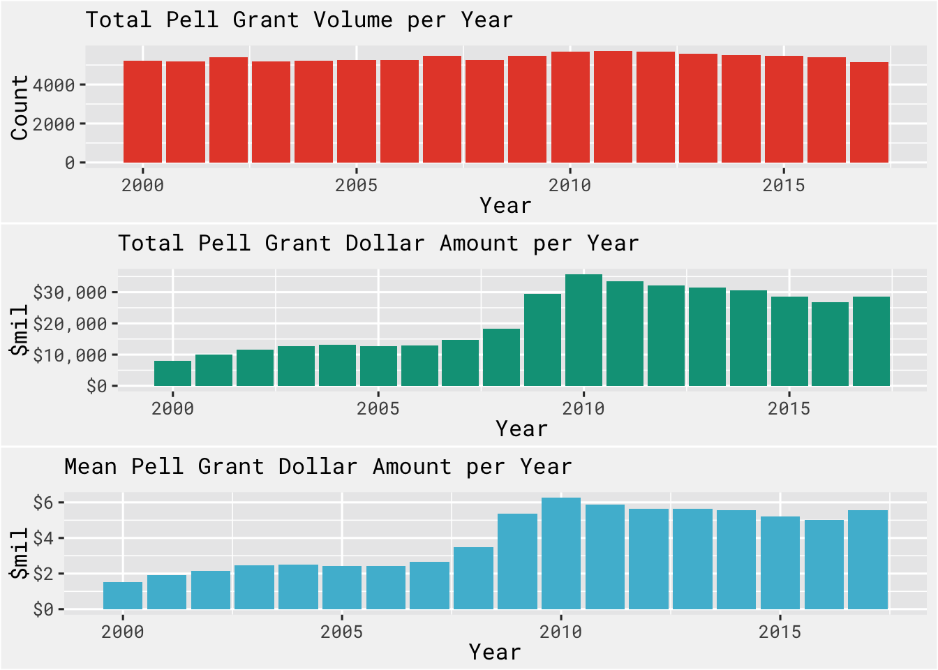
It looks like some time around 2009 the total dollar amount of Pell grants increased and remained at a higher level the prior to 2009. The volume of grants remained constant though, so we see the impact of this increase in the average amount per grant.
ggpubr::ggarrange(

  pell %>%
    group_by(year) %>%
    tally() %>%
    ggplot(., aes(x = year, y = n)) +
    geom_col(fill = bg_red) +
    bg_theme(base_size = 12, plot_title_size = 12) +
    labs(x = "Year", y = "Count", title = "Total Pell Grant Volume per Year"),

  pell %>%
    group_by(year) %>%
    summarise(total_amt = sum(award, na.rm = T)) %>%
    ggplot(., aes(x = year, y = total_amt/1000000)) +
    geom_col(fill = bg_green) +
    bg_theme(base_size = 12, plot_title_size = 12) +
    scale_y_continuous(labels = dollar) +
    labs(x = "Year", y = "$mil", title = "Total Pell Grant Dollar Amount per Year"),

  pell %>%
    group_by(year) %>%
    summarise(mean_amt = mean(award, na.rm = T)) %>%
    ggplot(., aes(x = year, y = mean_amt/1000000)) +
    geom_col(fill = bg_blue) +
    bg_theme(base_size = 12, plot_title_size = 12) +
    scale_y_continuous(labels = dollar) +
    labs(x = "Year", y = "$mil", title = "Mean Pell Grant Dollar Amount per Year"),
  nrow = 3,
  ncol = 1
)
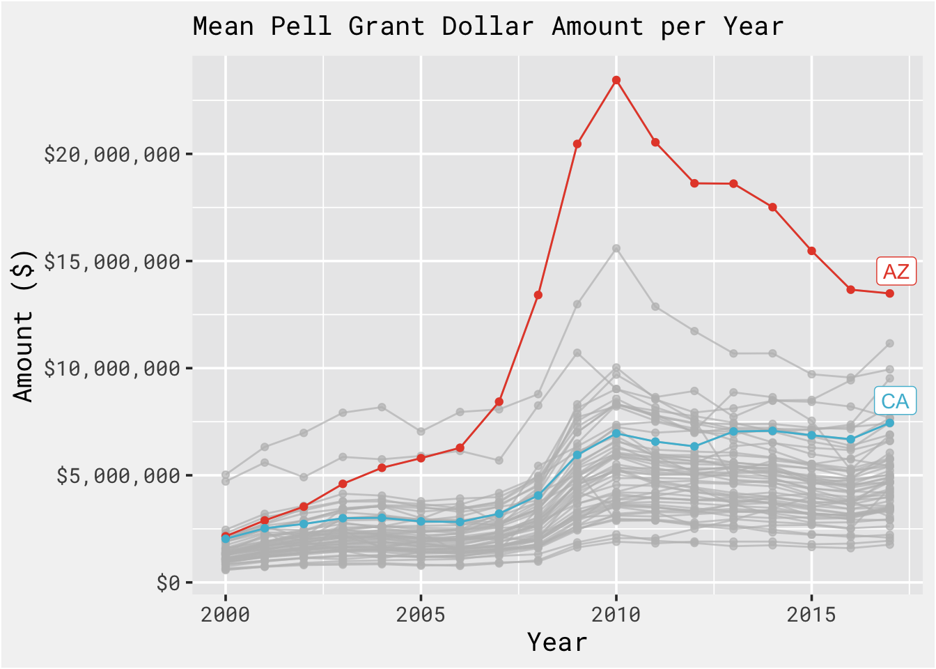
Looking state by states we can see not all states behave the same. Some states spike post 2009 and come down to a new baseline level like AZ, while some increase and remain steady at a new level, like CA.
pell %>%
  group_by(state, year) %>%
  summarise(mean_amt = mean(award, na.rm = T)) %>%
  ungroup() %>%
  ggplot(., aes(x = year, y = mean_amt, color = state)) +
  geom_line() +
  geom_point() +
  scale_y_continuous(labels = dollar) +
  gghighlight(label_key = state, use_direct_label = T, state %in% c("CA", "AZ"), use_group_by = FALSE) +
  labs(x = "Year", y = "Amount ($)", title = "Mean Pell Grant Dollar Amount per Year") +
  scale_color_npg() +
  bg_theme(base_size = 14, plot_title_size = 14)
Digging into this post 2009 increase some more, there is some evidence that the policy changes as a result of the 2008 financial crisis can explain some of what we’re seeing in the data.
Specifically, that document notes that
the recession of 2007–2009 and the subsequent slow recovery drew more students into the recipient pool. Eligibility increased as adult students and the families of dependent students experienced losses in income and assets; enrollment of eligible students also rose as people who had lost jobs sought to acquire new skills and people who would have entered the workforce enrolled in school because they could not find employment. The expansion of online education, particularly at for-profit institutions, attracted still more students, many of whom were eligible for Pell grant.
Visualizing the Change
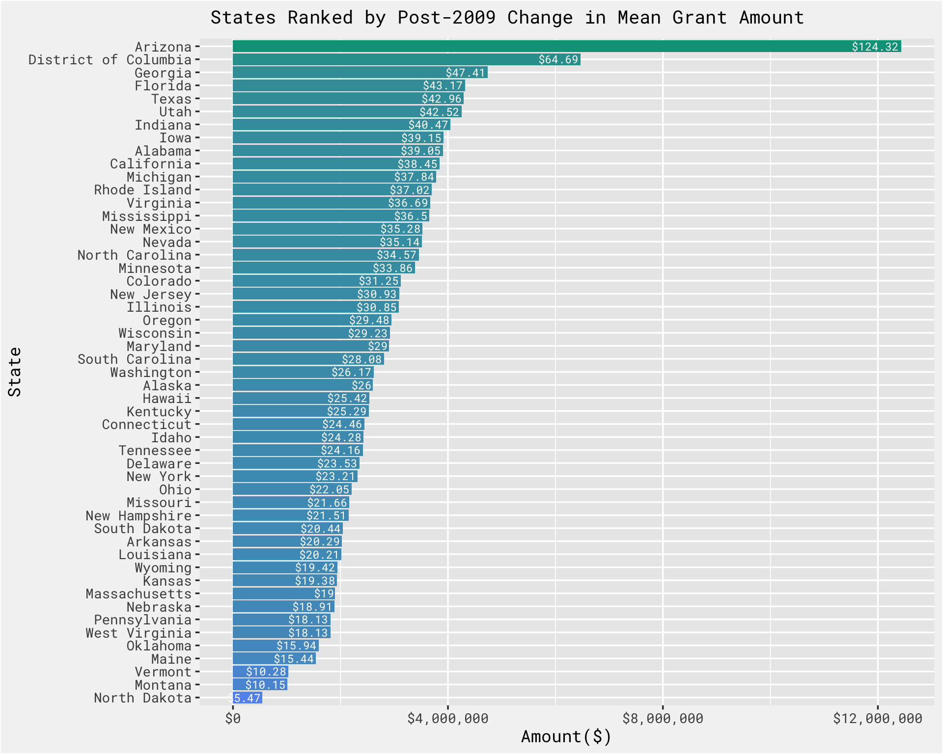
This plot ranks states in order of change post-2009, with Arizona leading the way.
# https://www.cbo.gov/sites/default/files/cbofiles/attachments/44448_PellGrants_9-5-13.pdf

time_prep <-
  pell %>%
  mutate(timeframe = ifelse(year < 2009, "pre_2009", "post_2009")) %>%
  group_by(year, state_name, timeframe) %>%
  summarise(total = n()) %>%
  ungroup() %>%
  group_by(state_name, timeframe) %>%
  mutate(mean_grants = mean(total)) %>%
  select(state_name, timeframe, mean_grants)

pell_time_state_comparison <-
  pell %>%
  mutate(timeframe = ifelse(year < 2009, "pre_2009", "post_2009")) %>%
  group_by(state_name, timeframe) %>%
  summarise(total_amt = sum(award, na.rm = T),
            mean_amt = mean(award, na.rm = T),
            sd_amt = sd(award, na.rm = T)) %>%
  left_join(., time_prep, by = c("state_name", "timeframe")) %>%
  distinct()


pell_time_state_comparison %>%
  select(state_name, mean_amt, timeframe) %>%
  pivot_wider(names_from = timeframe, values_from = mean_amt) %>%
  mutate(diff = post_2009 - pre_2009) %>%
  filter(!(is.na(state_name))) %>%
  ggplot(., aes(x = reorder(state_name, diff), y = diff, label = paste0("$", round(diff/100000,2)),  fill = log(diff))) +
  scale_y_continuous(labels = scales::dollar) +
  scale_fill_gradient(low = "cornflowerblue", high = bg_green) +
  geom_col(show.legend = FALSE) +
  coord_flip() +
  bg_theme(base_size = 13, plot_title_size = 14) +
  geom_text(hjust = 1.05, family = 'RobotoMono-Regular', size = 3, color = 'white') +
  labs(y = "Amount($)", x = "State", title =" States Ranked by Post-2009 Change in Mean Grant Amount")
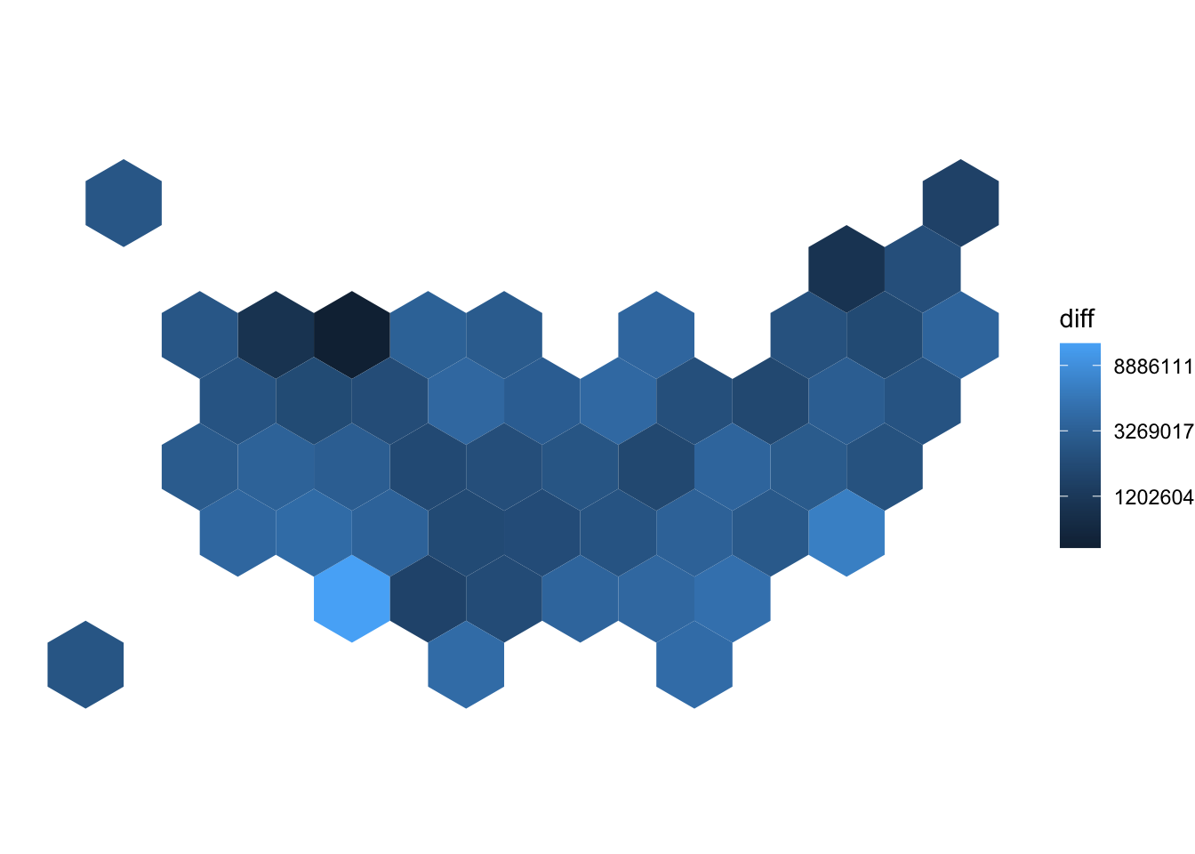
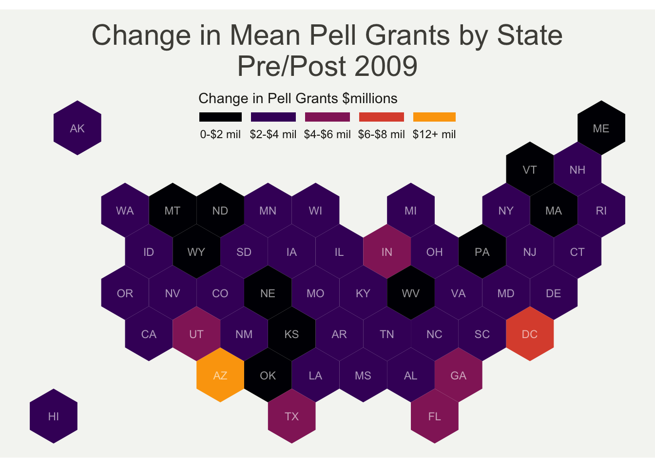
We can also visualize these increases using a hex bin map, in which each state is represented by a hexagon , color coded with the post-2009 increase in avg Pell grant money received.
# https://r-graph-gallery.com/328-hexbin-map-of-the-usa.html
# Download the Hexagones boundaries at geojson format here:
# https://team.carto.com/u/andrew/tables/andrew.us_states_hexgrid/public/map.
library(tidyverse)
library(geojsonio)
library(RColorBrewer)
library(rgdal)
# Download the Hexagones boundaries at geojson format here: https://team.carto.com/u/andrew/tables/andrew.us_states_hexgrid/public/map.
# Load this file. (Note: I stored in a folder called DATA)
spdf <-
geojson_read(here::here("content", "blog", "pell", "us_states_hexgrid.geojson"),
what = "sp")
# Bit of reformating
spdf@data <-
spdf@data %>%
mutate(google_name = gsub(" \\(United States\\)", "", google_name))
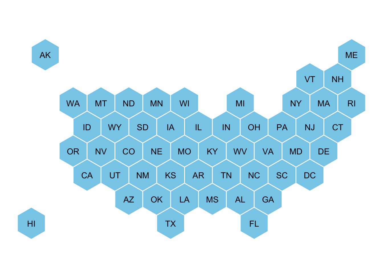
# Show framework
# plot(spdf)
library(broom)
spdf_fortified <-
tidy(spdf, region = "google_name")
library(rgeos)
centers <-
cbind.data.frame(data.frame(gCentroid(spdf, byid=TRUE), id=spdf@data$iso3166_2))
ggplot() +
geom_polygon(data = spdf_fortified, aes( x = long, y = lat, group = group), fill="skyblue", color="white") +
geom_text(data=centers, aes(x=x, y=y, label=id)) +
theme_void() +
coord_map()
# Merge geospatial and numerical information
spdf_fortified <-
  spdf_fortified %>%
  left_join(. , pell_time_state_comparison %>%
              select(state_name, mean_amt, timeframe) %>%
              pivot_wider(names_from = timeframe, values_from = mean_amt) %>%
              mutate(diff = post_2009 - pre_2009), by = c("id" = "state_name"))

# Make a first chloropleth map
ggplot() +
  geom_polygon(data = spdf_fortified, aes(fill =  diff, x = long, y = lat, group = group)) +
  scale_fill_gradient(trans = "log") +
  theme_void() +
  coord_map()
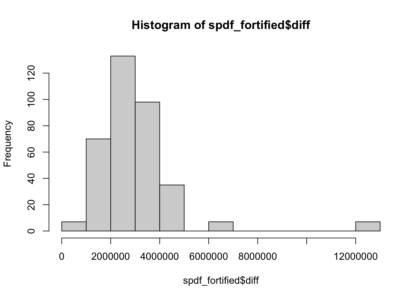
hist(spdf_fortified$diff)
# Prepare binning

spdf_fortified$bin <-
  cut(spdf_fortified$diff,
      breaks =c(seq(0, 12000000, 2000000), Inf),
      labels = c("0-$2 mil", "$2-$4 mil", "$4-$6 mil", "$6-$8 mil", "$8-$10 mil", "$10-$12 mil", "$12+ mil"),
      include.lowest = TRUE)

# Prepare a color scale coming from the viridis color palette
library(viridis)
my_palette <-
  viridis::inferno(6)

ggplot() +
  geom_polygon(data = spdf_fortified, aes(fill = bin, x = long, y = lat, group = group)) +
  geom_text(data=centers, aes(x=x, y=y, label=id), color="white", size=3, alpha=0.6) +
  theme_void() +
  coord_map() +
  scale_fill_manual(
    values = my_palette,
    name = "Change in Pell Grants $millions",
    guide = guide_legend(keyheight = unit(3, units = "mm"),
                          keywidth=unit(12, units = "mm"),
                         label.position = "bottom",
                         title.position = 'top', nrow=1)
  ) +
  ggtitle("Change in Mean Pell Grants by State\nPre/Post 2009") +
  theme(
    legend.position = c(0.5, 0.9),
    text = element_text(color = "#22211d"),
    plot.background = element_rect(fill = "#f5f5f2", color = NA),
    panel.background = element_rect(fill = "#f5f5f2", color = NA),
    legend.background = element_rect(fill = "#f5f5f2", color = NA),
    plot.title = element_text(size= 22, hjust=0.5, color = "#4e4d47", margin = margin(b = -0.1, t = 0.4, l = 2, unit = "cm")),
  )
- Posted on:
- September 10, 2022
- Length:
- 6 minute read, 1156 words
- Categories:
- tidy tuesday data viz hex bin map
- Tags:
- tidy tuesday data viz hex bin map